A new identity calls

for a new website

A new identity calls

for a new website

A new identity calls

for a new website

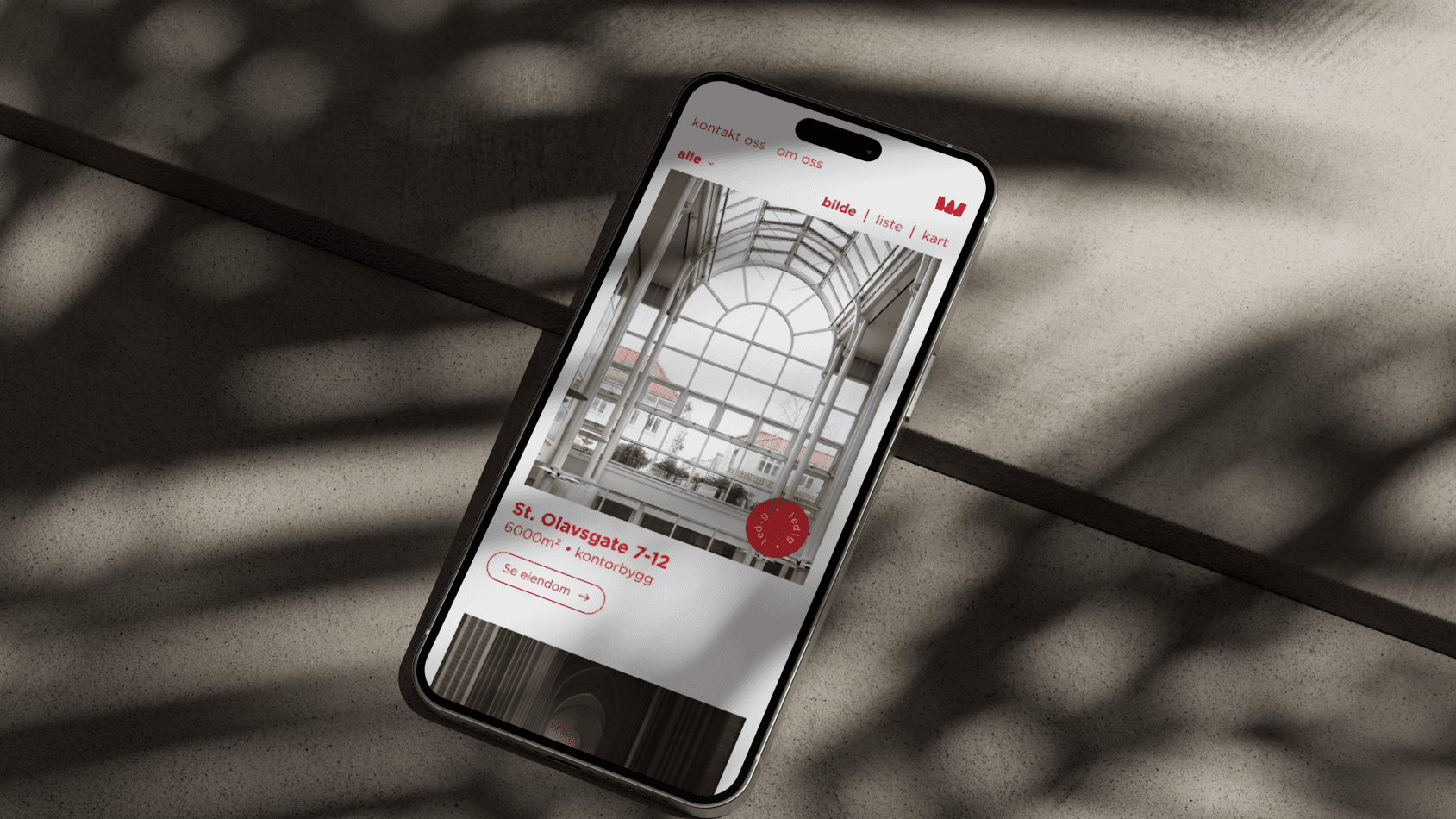
An iPhone laying on a concrete floor showing the Westco Eiendom webpage frontpage.

Client

Westco Eiendom

Client

Westco Eiendom

Client

Westco Eiendom

Agency

Fasett

Agency

Fasett

Agency

Fasett

Development

Grensesnitt

Development

Grensesnitt

Development

Grensesnitt

Photography

Bitmap

Photography

Bitmap

Photography

Bitmap

Westco Eiendom is part of the well-known company Westco with Westco Miljø being the market leader in container rental and waste management.


Westco Eiendom manages approximately 70.000m2 of properties as well as being the largest owner of the investment company Buøy Invest.


As a part of a rebrand project their websites needed some heavy uplifting. Inspired by the grids and lines in the buildings themselves, and with a client who was willing to go a little outside the box with us; here is what I came up with.

My role in this project was as lead designer for the website.
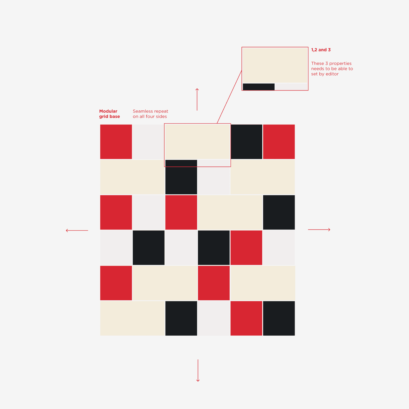
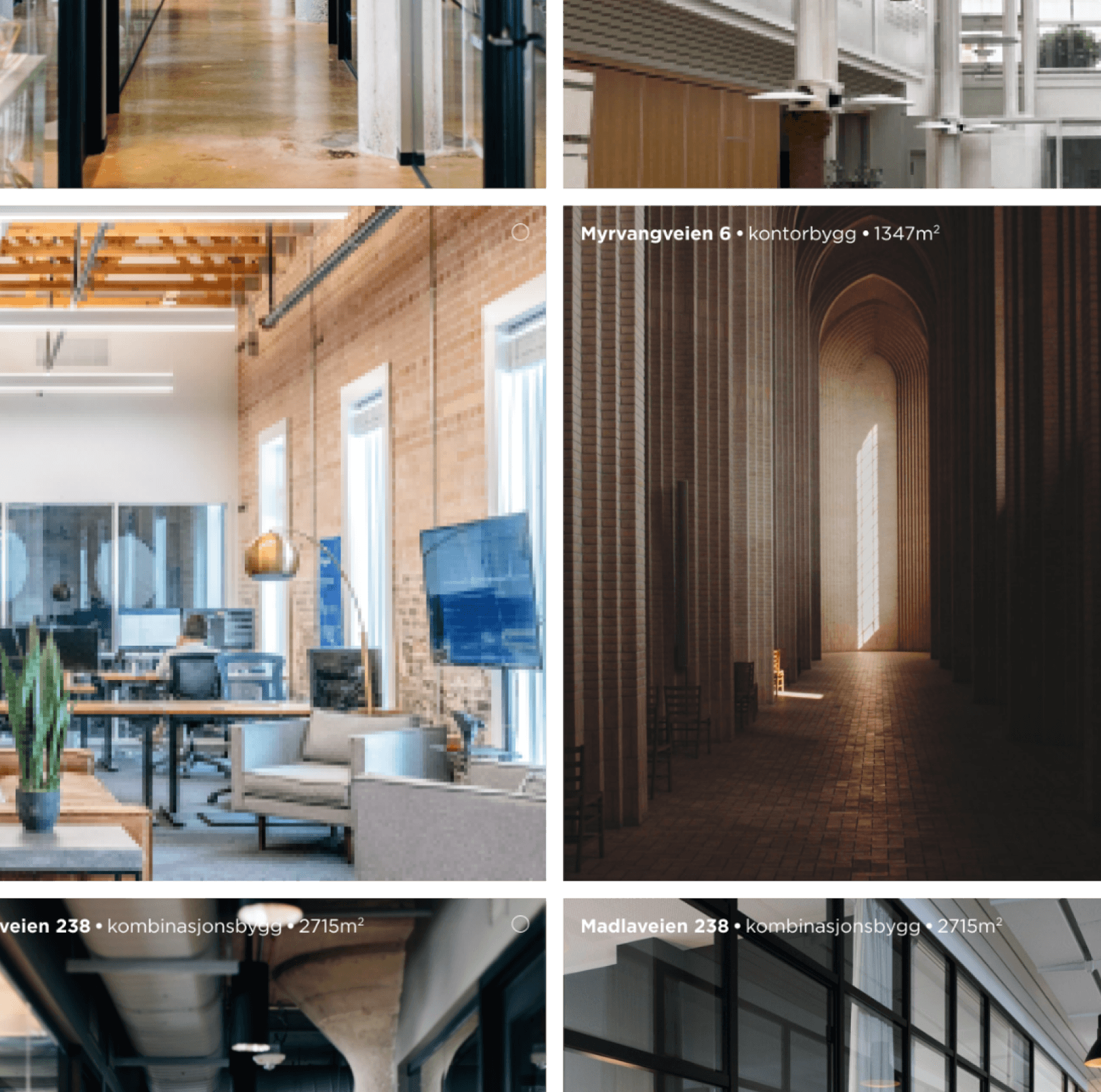
Showcasing the properties immediately when you open the home page in a self-repeating pattern in all directions. With large imagery showing both the interior and exterior of the buildings. The grid pattern also works well with 3D renderings and floor plan drawings.

Showcasing the properties immediately when you open the home page in a self-repeating pattern in all directions. With large imagery showing both the interior and exterior of the buildings. The grid pattern also works well with 3D renderings and floor plan drawings.

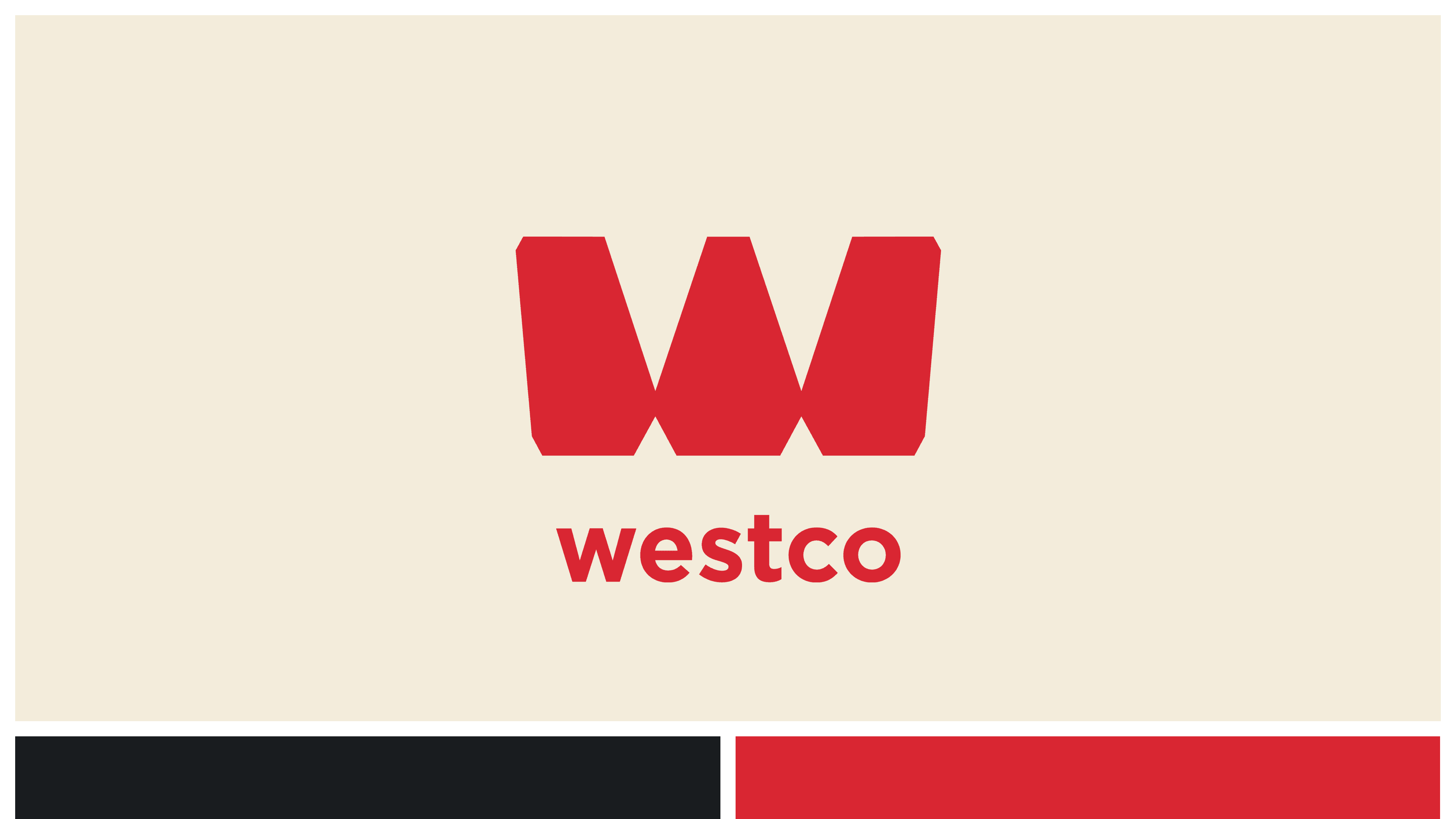
The Westco Eiendom logo in a large beige square and ablack and red square underneath.
A grid of colored squares that can be repeated on all sides endlessly. The four colors are red, beige, grey and dark grey.
A collage of interior images

The grid pattern for the frontpage started on a pink post-it note, before testing it in a Figma prototype with color-coordinated blocks, and later a more high-fidelity one with images that could be shown to the client.


We kept the color blocks as a pre-loader for slow loading images and a nice visual effect when browsing the frontpage.

Looking up on a tall building full of windows and a blue sky.
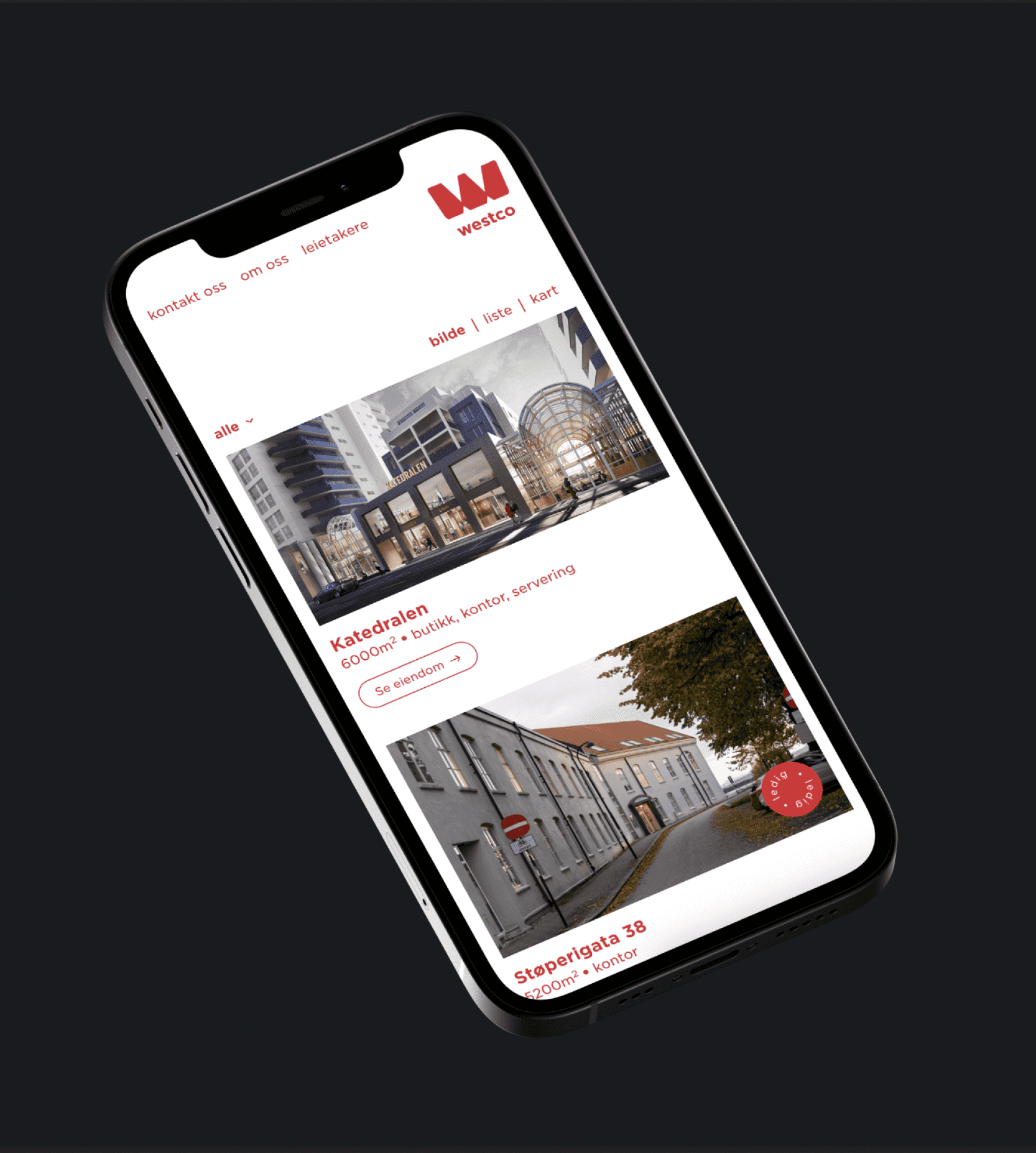
iPhone on a dark background showing the frontpage of the mobile version of the Westco Eiendom website.
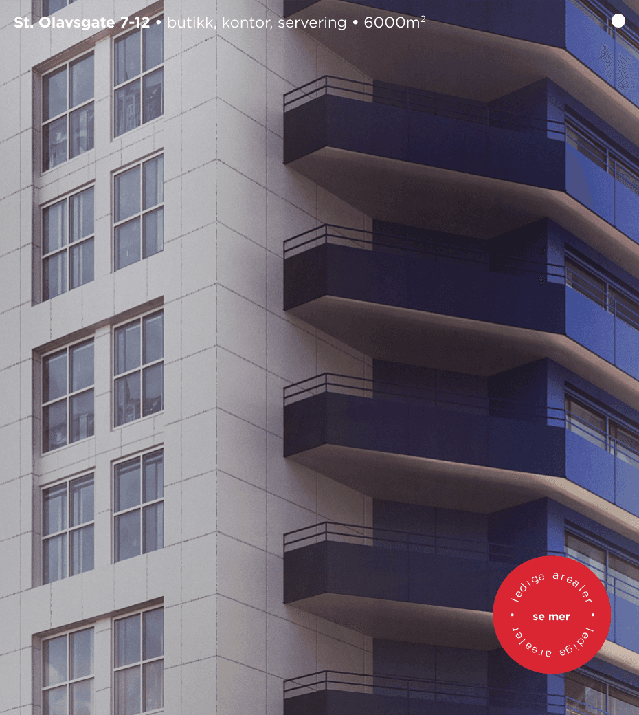
Closeup of a building with windows on the left and blue balconies on the right.
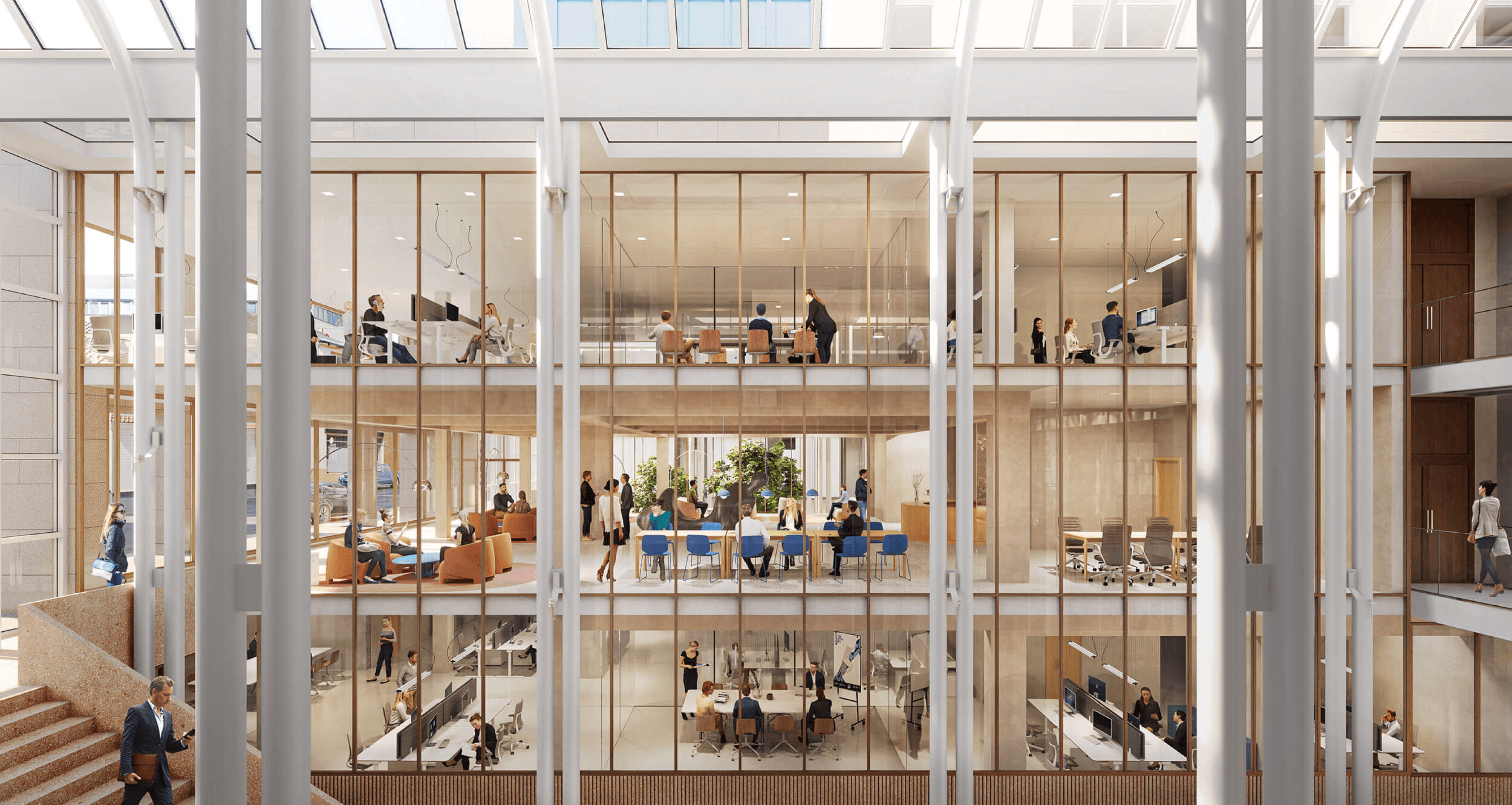
3D render of St. Olavs gate.
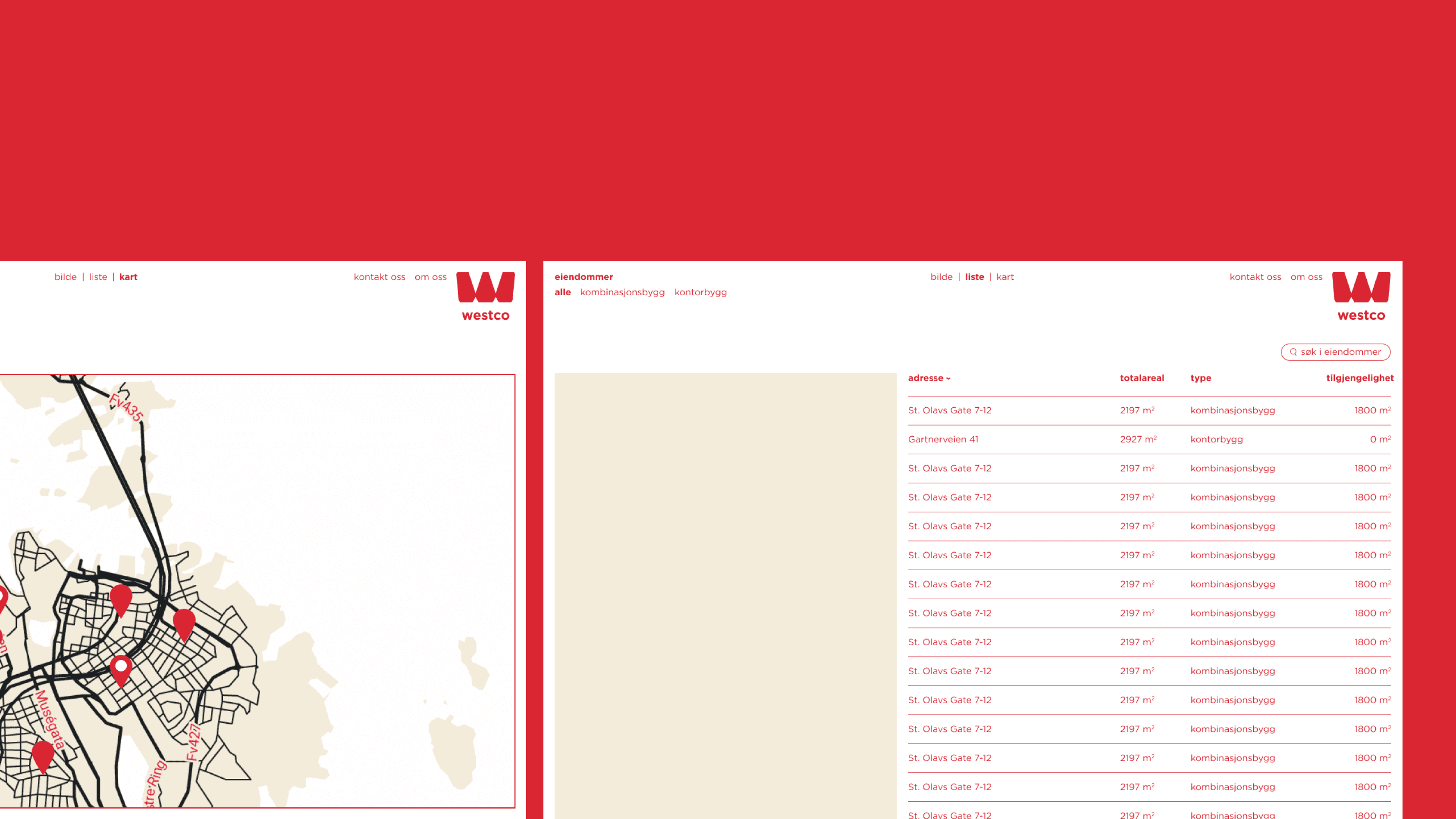
One and a half screen of the Westco Eiendom website showing the different frontpage modes: listview and map view.

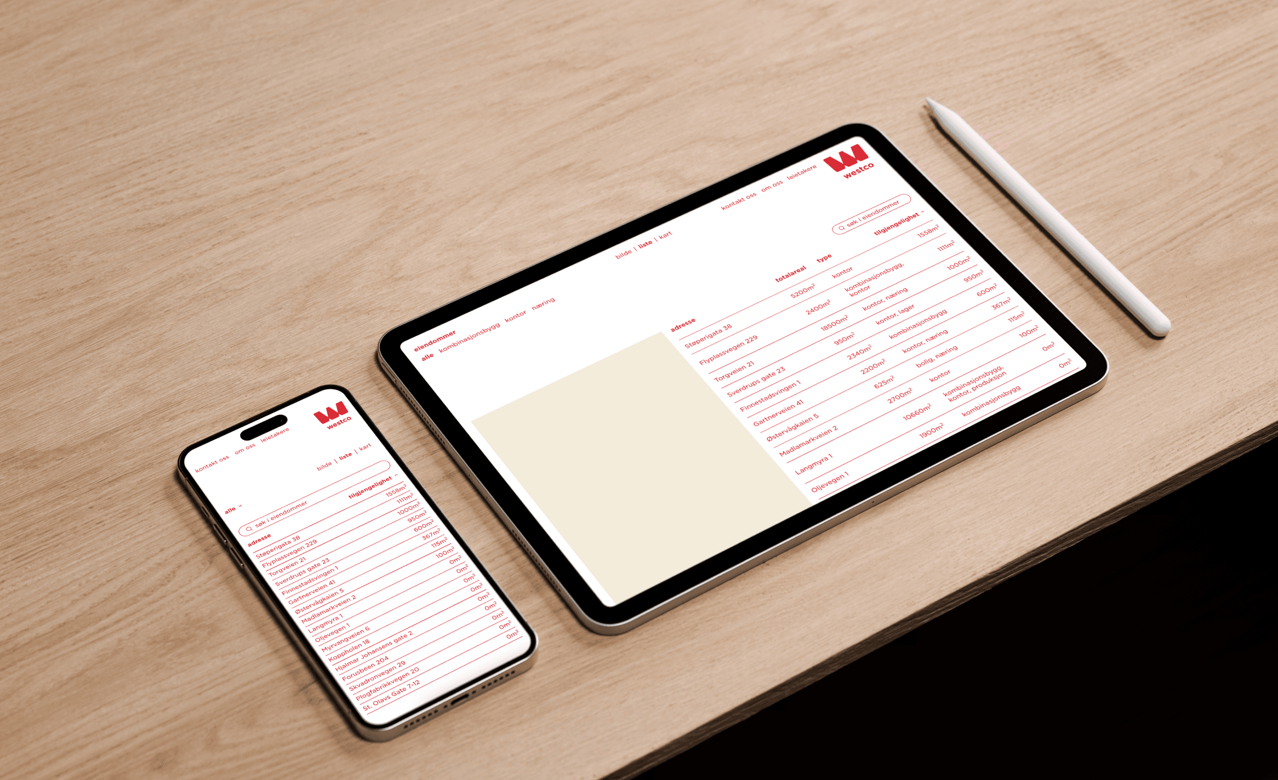
Catering to different users needs and behaviours by adding list-view and map-view to the frontpage.

Catering to different users needs and behaviours by adding list-view and map-view to the frontpage.

An iPhone and iPad on a table showing the Westco Eiendom website frontpage listview mode.
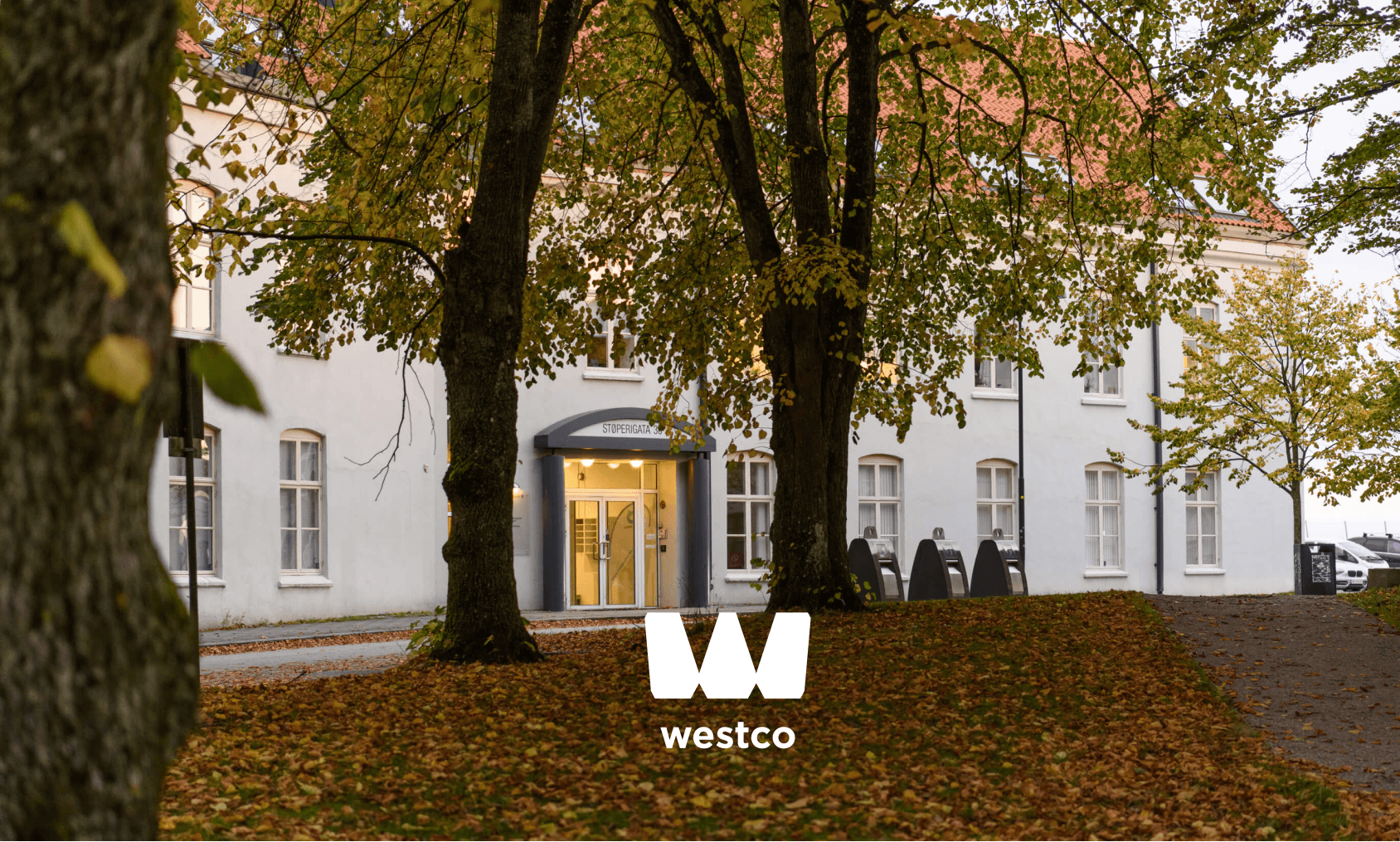
The Westco Eiendom logo overlayed on an image showing the property in Støperigata with trees in front of it. With orange leaves on the ground.

View the live page at westcoeiendom.no.

View the live page at westcoeiendom.no.

Send me an email or find me on Instagram

Send me an email or find me on Instagram

Send me an email or find me on Instagram